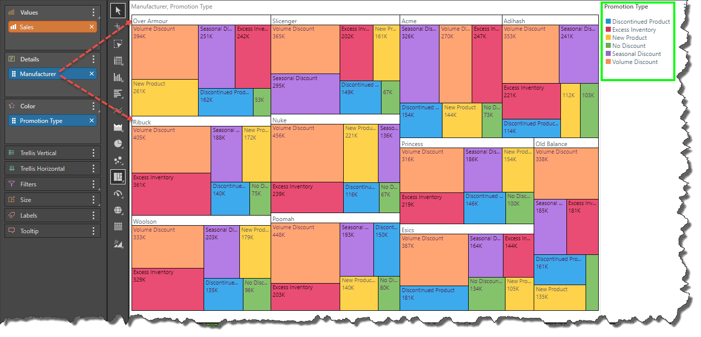
When working with hierarchical tree maps and hierarchical circle mapping charts, each data point is colored according to the hierarchy added to the Color drop zone, and grouped according to the hierarchy in the Details drop zone. The result is that each hierarchical group contains multiple colors, as in the image below. The hierarchical chart can be grouped by color instead, so that each group is both colored and organized according to the hierarchy in the Color zone.
Group by Color Button
Access the Group by Color button from the Component ribbon. Toggle the button on to group by color; click the button again to toggle off.

In this example, Group by color was enabled; the Manufacturer hierarchy labels now appear on the data points (rather than the header labels). The Promotion Type labels are used as group headers, so that each group of data points contains only one color.
